In this blog, I will show how to evaluate the business value from a machine learning model built in SAP HANA using R.
Combining SAP HANA & R allows the data scientist or advanced business analyst to leverage the power of SAP HANA and at the same time get the vast functionality from the use of R Packages. The main benefit with an approach of using SAP HANA in combination with R is that it allows you to utilize the power of SAP HANA both in terms of scalability and performance through R scripting. In a nutshell, there is no movement of training data from SAP HANA to the R server/client and the training of machine learning models is performed exactly the same place as where the data resides. In short: algorithms and data are on the same in-memory SAP HANA server.
In this blog, I will leverage an R package called modelplotr that provides easy debriefing of your machine learning models. Including a debriefing method that helps determine the actual business value that can be expected if the project is implemented and deployed.
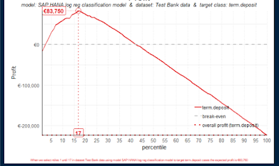
During this blog, you will see how to build the visualization below. This visualization provides you information with the business value ($83.750) expected if this machine learning project is built and put into production.
From my own experience as an SAP Data Science consultant, I am often faced with the question of how to show the actual business value that machine learning is bringing to a company. I will with an example be showing how to evaluate the built machine learning model from a business value perspective. This approach can be used to determine the business value and as such act as a communicating device when prioritizing projects within a company.
Moreover the approach can also calculate the actual benefit of machine learning and in specific the optimum threshold in a machine learning model – for instance the optimum number of potential customers to offer a product, prevent churn and so on.
Firstly I want to showcase how to build a simple machine learning model in SAP HANA – but using the data science language R. SAP HANA comes with a wide set of machine learning algorithms to deal with regression, classification, forecasting, etc. This library is called PAL – short for Predictive Analysis Library (see more in the references below). Some of the algorithms in PAL can now be accessed through the use of R. In the following, I am using Rstudio as my preferred graphical user interface to R.
1. Machine learning with SAP HANA – all Interaction performed directly from R
The use case presented in this blog is a rather simple dataset. I have chosen this dataset so that you potentially can re-do the steps I am showing in your own environment. The data science challenge is a classic supervised binary classification. Given a number of features all with certain characteristics, our goal is to build a machine learning model to identify customers interested in buying a financial service (term deposit). A term deposit is a cash investment held at a financial institution. Your money is invested for an agreed rate of interest over a fixed amount of time or term. Term deposits can be invested into a bank, building society or credit union.
This dataset is a subset of the dataset made available by the University of California, Irvine. The complete dataset is available here: https://archive.ics.uci.edu/ml/machine-learning-databases/00222/bank-additional.zip.
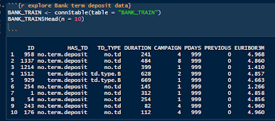
Let’s look at the data:
Data description
y: has the client subscribed a term deposit?
Duration: last contact duration, in seconds (numeric)
Campaign: number of contacts performed during this campaign and for this client
Pdays: number of days that passed by after the client was last contacted from a previous campaign
Previous: number of contacts performed before this campaign and for this client (numeric)
Euribor3m: euribor 3 month rate (The Euro Interbank Offered Rate (Euribor)).
First I connect to my SAP HANA Server from R:
Exploring the data (see appendix for an explanation of how I got the data into SAP HANA from R):
2. Realistic business problem solved with machine learning.
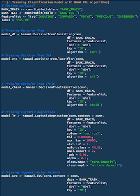
Creating and training many Machine Learning models from scratch. As shown below I don’t just create one machine learning model but many. The purpose is the evaluate the models and chose the model that is out-performing other algorithms on this specific dataset.
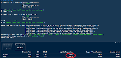
Evaluating the trained models. Here I am using the score function in SAP HANA. The result from each trained model is stored in a comparison table:
As shown above the model accuracy for logistic regression out-performs the decision trees, support vector machine and random forest (ensembles of trees). We are most interested in the model that out-performs on the test data – to avoid overfitting (models could potential “remember” all points in a training dataset).
3. Illustrating the actual business value.
In my previous blog, I showed how to build the Receiver Operating Characteristic (ROC) curve which is used to assess the accuracy of a continuous measurement for predicting a 2 class outcome (bi-variant classification). In marketing, sales, medicine, etc., the ROC curves have a long history of use for evaluating the usability of machine learning models. In a nutshell, the ROC curves help identify whether the build machine learning model provides better than random selection, however, it can also help identify the optimum threshold of true positives and false negatives. This can be very valuable in use cases where for instance there is a cost associated with contacting customers.
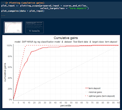
However, explaining the sensitivity and specificity of ROC-curves in a business meeting can be challenging. This is where the Gains chart can be used to simplify things. The Gain chart is in short a representation where on the X-axis we have the percentage of the customer base we want to target with the campaign. The Y-axis gives us the answer to what is the percentage of all positive response customers have been found in the targeted sample.
Now that we have a model it is time to evaluate the business potential with a visualization of the cumulative gains and where we start using the R package modelplotr with predicted results from the SAP HANA trained model.
Plotting the Cumulative gains curve:
As shown the “modelplotr” has a function named plotting_scope. If you are interested in how I build the the “scores_and_tiles” dataframe check the appendix below.
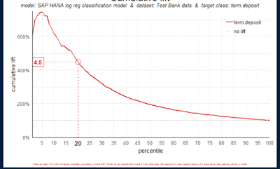
Plotting the lift curve:
After having prepared the plot_input data it is really easy to plot the additional curves:
plot_cumlift(data = plot_input, highlight_ntile = 20)
Plotting the profit curve:
Finally, we come to my favorite plot and one of the main reasons for this blog. This approach is just as the other plotting functions, however you can declare the fixed cost of initiating this project, the variable cost of contacting a customer and the profit per customer that accepts the offer.
The variables I entered are solely based on my own imagination and for illustrative purposes only.
Perfect, we have now built a number of machine learning models and chosen the model with the highest accuracy on test data (newer seen by the algorithm). Furthermore, we have used the built model to predict the probabilities of a customer being interested in the product we are offering (term.deposit) and have even shown what the expected business value could be if we were to implement the solution.
Lastly, we have shown that if we contact the 17% customers that have the highest probability of buying we will earn $83.750.
That concludes the blog thanks for reading.
Appendix 1 – Preparing data for the package modelplotr:
The modelplotr requires a dataframe with this exact shape:
column type definition
model_label Factor Name of the model object
dataset_label Factor Datasets to include in the plot as factor levels
y_true Factor Target with actual values
prob_[tv1] Decimal Probability according to model for target value 1
prob_[tv2] Decimal Probability according to model for target value 2
… … …
prob_[tvn] Decimal Probability according to model for target value n
ntl_[tv1] Integer Ntile based on probability according to model for target value 1
ntl_[tv2] Integerl Ntile based on probability according to model for target value 2
… … …
ntl_[tvn] Integer Ntile based on probability according to model for target value n
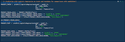
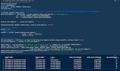
First step to build this dataframe is to execute the SAP HANA trained Model with train and test data.
This produces two small tables with an ID, Predicted class and the probability of the prediction.
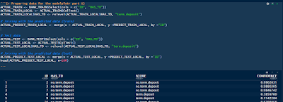
The second step is to build two dataframes that contains the probability of class = term.deposit. Remember the gains chart or ROC-curves needs to have the probability of a correctly class.
Final step is to stitch the data from the two previous steps:
This dataframe can now be consumed in the modelplotr functions.
plot_input <- plotting_scope(prepared_input = scores_and_ntiles,
select_targetclass = “term.deposit”, scope = “compare_datasets”)
plot_cumgains(data = plot_input)
Appendix 2 – loading data from R into SAP HANA:
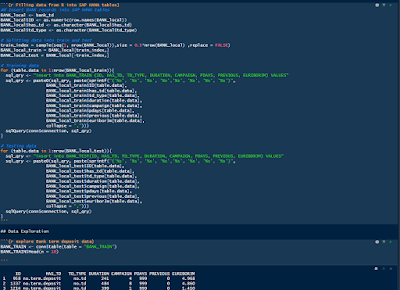
If you would like to reproduce the example that I have shared in this blog. Here is how you can load the shown data into SAP HANA in a very easy way. This code could also be modified to fit your own data. You can either go with the sample dataset or go to the link with the full dataset https://archive.ics.uci.edu/ml/machine-learning-databases/00222/bank-additional.zip
The approach with the sample dataset is shown in the following:
Creating the tables in SAP HANA:
Filling in the data and checking the results:
All done.
You have now created two new tables in SAP HANA and inserted the bank term deposit data.


